The Future of Responsive and Scalable Web Experiences
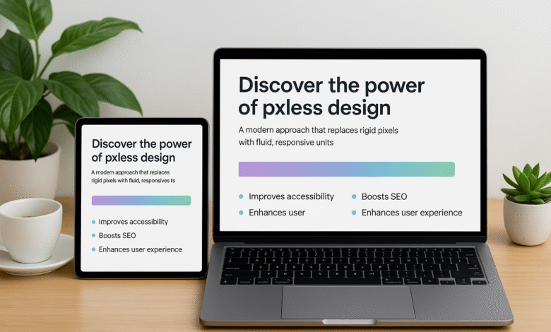
In today’s multi-device digital world, websites must look and function perfectly on every screen — from smartphones and tablets to laptops, desktops, and even TVs. The old pixel-based approach no longer delivers that flexibility. This is where pxless design comes in — a concept that transforms the way developers and designers create adaptive, fluid, and future-ready websites.
What Is Pxless?
Pxless design refers to a web development approach that minimizes or completely eliminates fixed pixel values. Instead of defining rigid dimensions like width: 300px or font-size: 16px, pxless uses relative units such as percentages (%), em, rem, vw (viewport width), and vh (viewport height). These flexible units allow a design to automatically scale and adapt to any screen size without breaking the layout.
In essence, pxless design replaces the ice cube-like rigidity of pixels with the fluid adaptability of water. Just as water takes the shape of its container, pxless design reshapes itself according to the user’s screen or device. This adaptability ensures that your website looks perfect, whether viewed on a 27-inch desktop or a 5-inch smartphone.
Why Pxless Design Matters
The importance of pxless design goes beyond just visual consistency. Modern users expect seamless functionality across all devices, and search engines like Google prioritize websites that meet these expectations. Pixel-dependent websites often struggle with layout issues, broken designs, or unreadable text when viewed on different screen sizes.
By going pxless, designers eliminate these issues entirely. The design becomes inherently responsive, automatically resizing fonts, containers, and images to fit the available space. This results in improved accessibility, smoother user experiences, and better SEO performance.
How Pxless Improves User Experience and Accessibility
Accessibility is at the core of pxless design. Users with visual impairments often rely on browser zoom or screen magnification tools. A traditional pixel-fixed design may break or overlap when zoomed in. Pxless design, however, scales proportionally. Text enlarges smoothly, images adjust their boundaries, and interactive elements remain easy to access and click.
For example, using rem or % units for text and layout ensures that content maintains its structure regardless of zoom levels or screen orientation. This adaptability creates a consistent experience for everyone — including users with accessibility needs.
The Technical Foundation of Pxless
To build pxless websites effectively, developers rely on modern CSS layout technologies such as Flexbox and CSS Grid.
-
Flexbox helps in creating flexible and responsive rows or columns. It adjusts the size of each element automatically, ensuring that content remains balanced and proportional.
-
CSS Grid allows developers to design complex layouts with relative units like
fr(fractional units), creating dynamic structures that respond naturally to the browser size.
In addition, pxless design encourages using modern CSS properties like clamp() for dynamic scaling. For instance, setting a font size as font-size: clamp(1rem, 2vw, 2rem) ensures that text grows with larger screens but doesn’t become too small or too large on extreme devices.
Pxless and SEO Benefits
Search engines have evolved to prioritize user experience. Since pxless design improves website performance, accessibility, and adaptability, it directly impacts SEO rankings.
A pxless layout enhances Core Web Vitals, particularly metrics like Cumulative Layout Shift (CLS) and Interaction to Next Paint (INP). When a site reflows smoothly without jarring jumps or cut-off elements, it earns better performance scores in Google’s algorithm.
Moreover, pxless designs tend to reduce unnecessary code, improving page load times — another critical factor for SEO success. By delivering consistent usability across all devices, pxless websites can boost engagement rates, reduce bounce rates, and increase overall user satisfaction.
Advantages of Pxless for Designers and Developers
-
Consistency Across Devices – Pxless ensures your design looks great on any screen, eliminating the need for multiple versions of a site.
-
Future-Proof Design – As new devices emerge (like foldable screens or AR/VR displays), pxless structures adapt automatically.
-
Improved Accessibility – Pxless layouts are more inclusive, accommodating users with disabilities or older hardware.
-
Reduced Maintenance – With fewer breakpoints and more flexible code, developers spend less time fixing layout issues.
-
Faster Development and Performance – Less CSS duplication means cleaner code, faster load times, and better scalability.
Challenges in Pxless Design and How to Overcome Them
Despite its advantages, adopting pxless design can present challenges, especially for teams transitioning from pixel-based workflows. Designers may feel they lose control over exact dimensions. However, pxless isn’t about losing control — it’s about gaining smarter, more flexible control through relative relationships.
To overcome challenges:
-
Use design tokens and shared style systems to maintain consistent scaling rules.
-
Test across multiple devices and browsers using tools like Chrome DevTools or BrowserStack.
-
Communicate clearly between design and development teams to ensure everyone understands how scaling units behave.
Most modern browsers now fully support rem, vw, vh, and clamp(), making pxless implementation easier than ever.
Implementing Pxless in Real Projects
If you’re ready to go pxless, start small:
-
Define a Scalable Base – Set
html { font-size: 62.5%; }so that 1rem equals 10px. This simplifies calculations. -
Use Relative Units – Replace pixel values with
rem,%,vw, andvh. -
Apply Fluid Typography – Use
clamp()for scalable font sizes that adjust naturally to screens. -
Make Images Flexible – Always use
max-width: 100%; height: auto;to prevent overflow. -
Limit Media Queries – Let your pxless foundation handle responsiveness; use breakpoints only for fine adjustments.
By applying these principles, you’ll achieve layouts that are fluid, efficient, and future-ready — all with minimal effort.
The Future of Pxless
The rise of pxless design marks a major shift toward accessibility, scalability, and user-centric development. As screens continue to evolve — from smartwatches to VR environments — pxless principles will ensure your digital experiences stay consistent and beautiful.
Embracing pxless today means designing not just for the present but for the ever-changing digital future. Whether you’re building a portfolio, an eCommerce store, or an enterprise platform, pxless gives you the tools to create designs that never break, no matter where they’re viewed.
FAQs
Q1. What is pxless in web design?
Pxless is a design method that avoids fixed pixel measurements. Instead, it uses relative units like %, em, rem, vw, and vh, allowing designs to scale smoothly across devices.
Q2. Why should I use pxless design?
Pxless design ensures websites remain fully responsive, accessible, and SEO-friendly. It provides consistent layouts across screen sizes without relying on static pixels.
Q3. Does pxless improve SEO performance?
Yes, pxless improves SEO by enhancing mobile usability and reducing layout shifts. Google rewards pxless sites for their better Core Web Vitals and smoother performance.
Q4. Is pxless design difficult to implement?
Not at all. By gradually replacing pixel units with rem, %, and viewport-based units, you can easily convert an existing design into a pxless one.
Q5. What units replace pixels in pxless design?
Pxless design uses %, em, rem, vw, and vh — all of which scale dynamically according to the device or user settings.
Read also:Lbythj: The Power of Tradition and Innovation in Modern Culture